


Optical illusions, while often associated with art or magic tricks, also extend to the world of aerial and satellite imagery. One such illusion is relief inversion, a phenomenon that can significantly alter our perception of geographical landscapes.
When looking at aerial and satellite imagery, telling the difference between a canyon and a mountain can sometimes be tricky due to an optical illusion known as relief inversion. This illusion can cause high areas such as mountains to appear as valleys, and vice versa, a strange reversal that can have implications for the interpretation of these images.
Relief inversion is also known as false topographic perception phenomenon (FTPP).
What causes relief inversion?
Most people have a subconscious interpretation of images based on the assumption that objects are illuminated from above. We expect the light source to come from the upper left corner of an image and when it doesn’t our brains flip mountains into canyons and vice versa to compensate.
Essentially, our brain interprets shadows as indicators of depth, considering them to be depressions or valleys. When shadows appear on the northern side of features due to a southern light source (or vice versa in the Southern Hemisphere), our brain reads this correctly.
However, when the light source is from the north (or the south in the Southern Hemisphere), shadows appear on the southern side of features, causing our brain to misinterpret these shadows, seeing elevated areas as depressions and depressed areas as elevations.
Geographic variations in perceptions of relief inversion
A study published in the International Journal of Digital Earth looked at latitudinal variation in relief inversion and perceptions of . For the study, 313 participants evaluated the relief inversion effect using satellite images from the equatorial region. The experiment was designed to assess how these individuals perceived landforms—specifically valleys and ridges—in 16 different images.
The study found that the influence of the optical illusion was less prevalent among participants between 2–5° south of the Equator compared to satellite images around the Equator or taken in the Northern Hemisphere. Age, biological sex, education, or experience among the participants were not found to have an influence on perceptions of relief inversion.
Examples of relief inversion
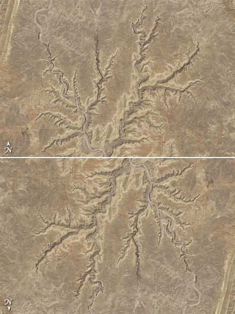
In an excellent example of relief inversion, NASA astronaut Kjell Lindgren tweeted a photograph taken from the International Space Station while flying over the Colorado River in Arizona in which he noted how the shadows make the canyon look like a ridge:
In both of these photos (above and below) showing the winding Colorado river, the walls of the canyon appear as if they are ridges that are elevated against the adjacent desert.
Rotate the Satellite Image to Adjust for Relief Inversion
Oftentimes with relief inversion, the proper visual interpretation can be achieved by rotating the image so the perceived light originates from the upper left corner.
Why Do Cartographers Light Relief Maps From the Top of the Map?
If you’ve ever looked at a relief map, you may notice that the lighting always appears from the top left of the map, northwest for maps that are north oriented. The reason for this is related to relief inversion.
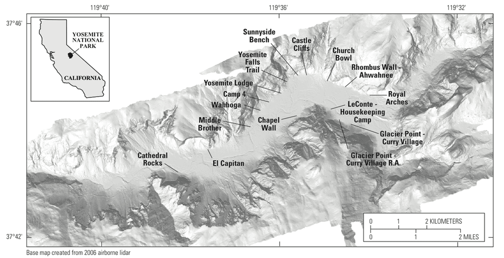
When the map is illuminated from a direction other than the upper right corner, the displayed topography will look off to someone viewing the map. Due to relief inversion, valleys will look like ridges and ridges will look like canyons. This cartographic convention lessens the likelihood of relief inversion occurring.
By lighting the map from above (which is where humans expect light to come from) instead of the below (or south for north oriented maps), shaded topography appears “correct” to the human eye.
References:
Bernabé-Poveda, M. Á., Gołębiowska, I., Narváez-Benalcázar, R., León-Pazmiño, M. F., Gonzalez-Campos, M. E., & Çöltekin, A. (2024). Sunshine around the middle Earth: relief inversion less prevalent in satellite images in the near-south of the Equator than on the Equator. International Journal of Digital Earth, 17(1), 2304078.
Illumination. (n.d.). Shaded Relief. https://www.shadedrelief.com/retro/discussion.html
Liu, B., & Todd, J. T. (2004). Perceptual biases in the interpretation of 3D shape from shading. Vision research, 44(18), 2135-2145. https://doi.org/10.1016/j.visres.2004.03.024
Scott, M. (2011, July 12). Are you ever fooled by relief inversion?. NASA Earth Observatory. https://earthobservatory.nasa.gov/blogs/earthmatters/2011/07/12/are-you-ever-fooled-by-relief-inversion/
Learn About a New Cartographic Technique With Each Chapter
To learn about shaded relief and more:
Each chapter of Cartographic Grounds takes a look at a different cartographic technique, illustrated with maps. The ten chapters look at sounding/spot elevation, isobath/contour, hachure/hatch, shaded relief, land classification, figure-ground, stratigraphic column, cross-section, line symbol, and conventional sign. Each technique is illustrated through the use of plans and maps, in all, the book contains 275 pages highlighting each of the cartographic techniques described.
Edited by Harvard professors Jill Desimini and Charles Waldheim, the book pulls examples from a range of cartographers both past and present. Desimini, in an article on Atlas Obscura, explains why good maps are critical visualization products. “Good cartographers do an amazing job of synthesizing an incredible amount of geographical information into an accessible and legible depiction of the surface of the earth. They don’t just see the world; they see the relationship between the visual information offered by the world and the languages used in maps.”
(Geography Realm is a participant in the Amazon Services LLC Associates Program, an affiliate advertising program designed to provide a means for sites to earn advertising fees by advertising and linking to amazon.com.)
Cartographic Grounds: Projecting the Landscape Imaginary
by Jill Desimini and Charles Waldheim (Editors)
This article was originally written on July 3, 2021 and has since been updated.
More Geography Phenomenon
Fonte : National Geographic


")


")


